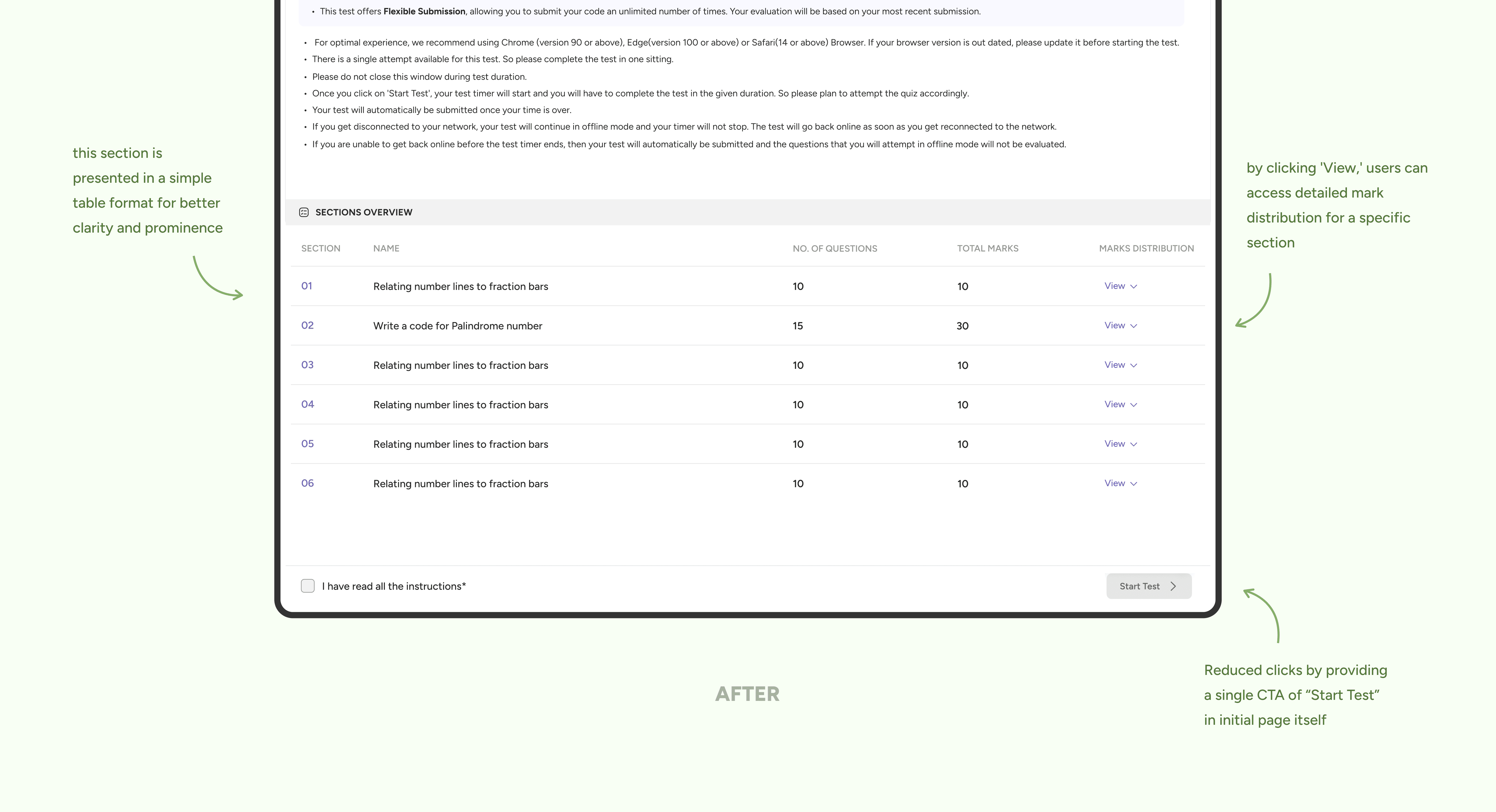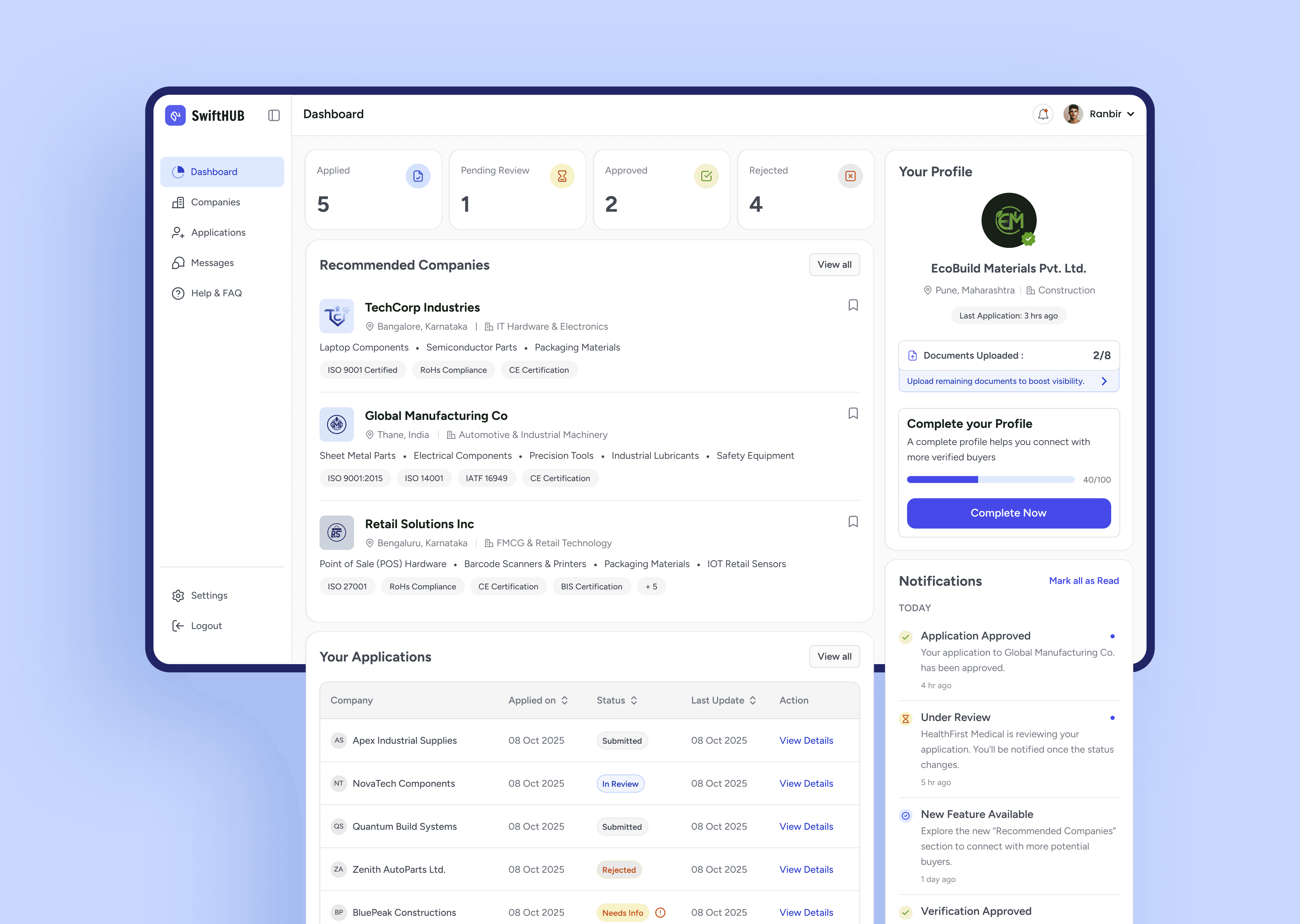
Collaborated with cross-functional teams to design an intuitive, responsive platform that simplifies the test process.
Collaborated with cross-functional teams to design an intuitive, responsive platform that simplifies the test process.


🔍
🔍
from Microsoft Clarity
from Microsoft Clarity
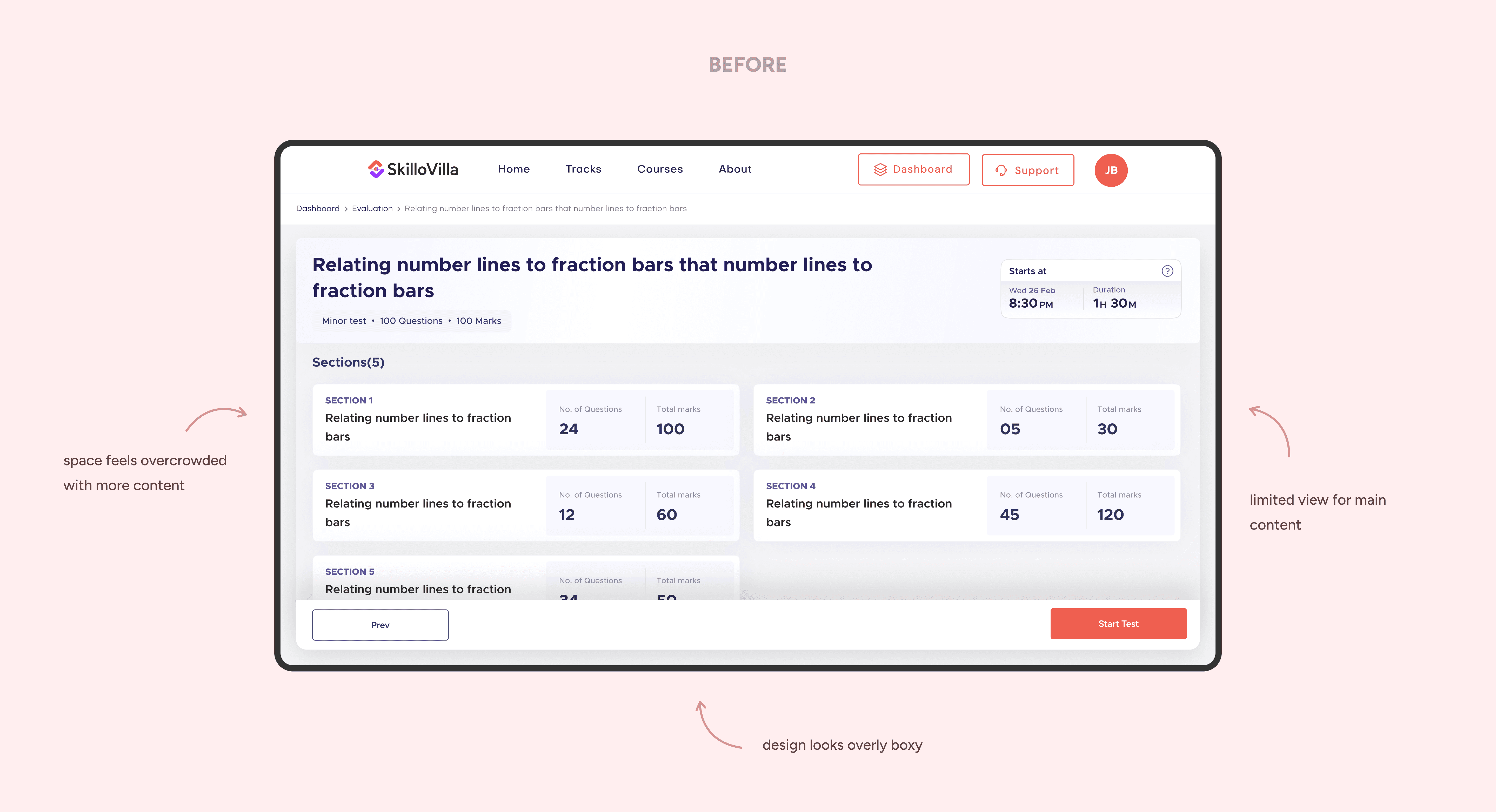
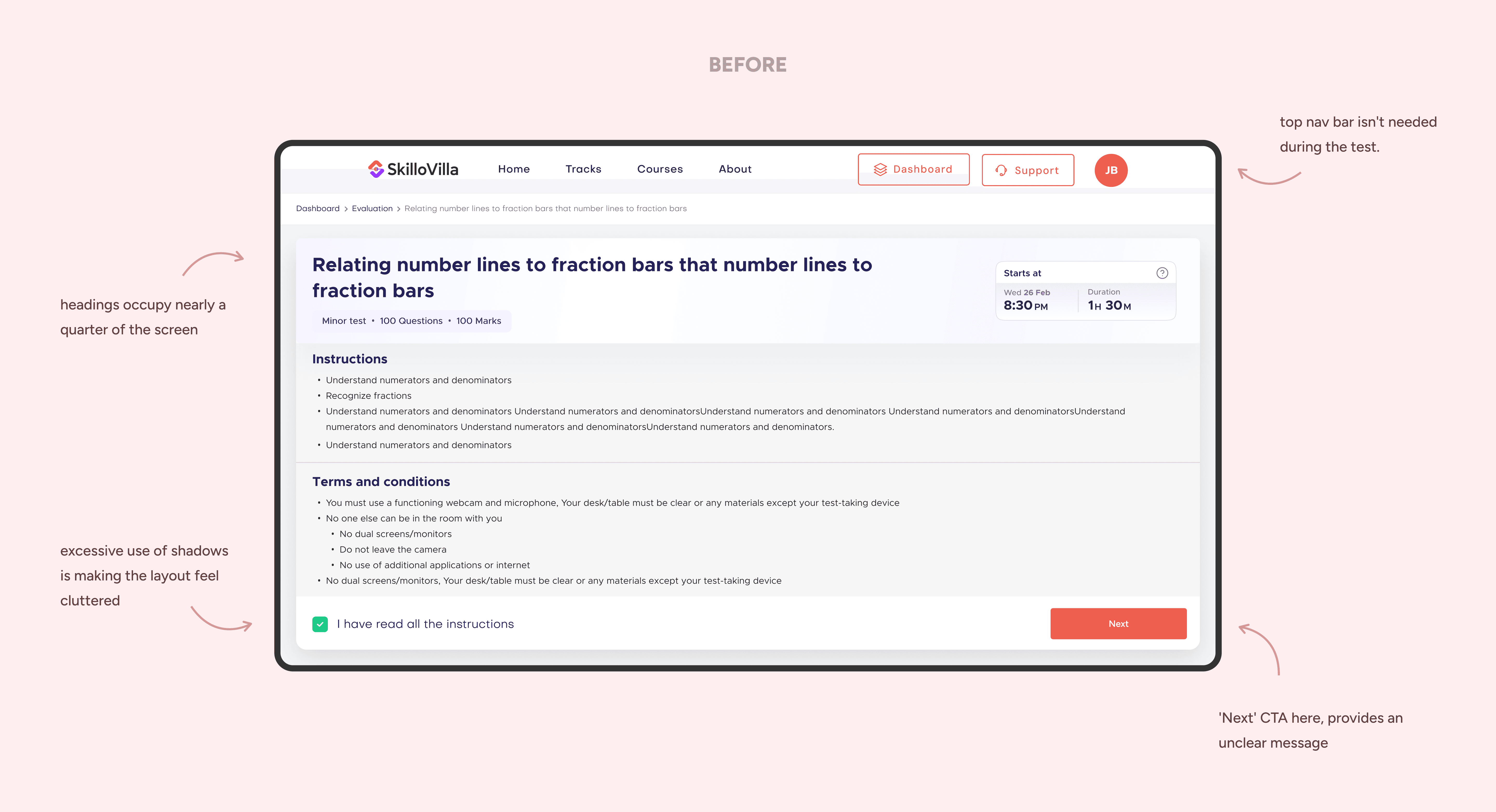
Key interactive elements were barely clicked, suggesting users didn’t realize these options were available.
Key interactive elements were barely clicked, suggesting users didn’t realize these options were available.
On observing Session recordings showed that users often spent 30% more time than expected on simple tasks.
On observing Session recordings showed that users often spent 30% more time than expected on simple tasks.
Heatmaps highlighted users clicking on non-interactive areas. This indicated confusion about where to find the actions they needed.
Heatmaps highlighted users clicking on non-interactive areas. This indicated confusion about where to find the actions they needed.
💬
💬
from Surveys
from Surveys
We asked users to rate their experience with the platform, and most gave it a ⭐️ 3/5, describing it as “okay”.
We asked users to rate their experience with the platform, and most gave it a ⭐️ 3/5, describing it as “okay”.
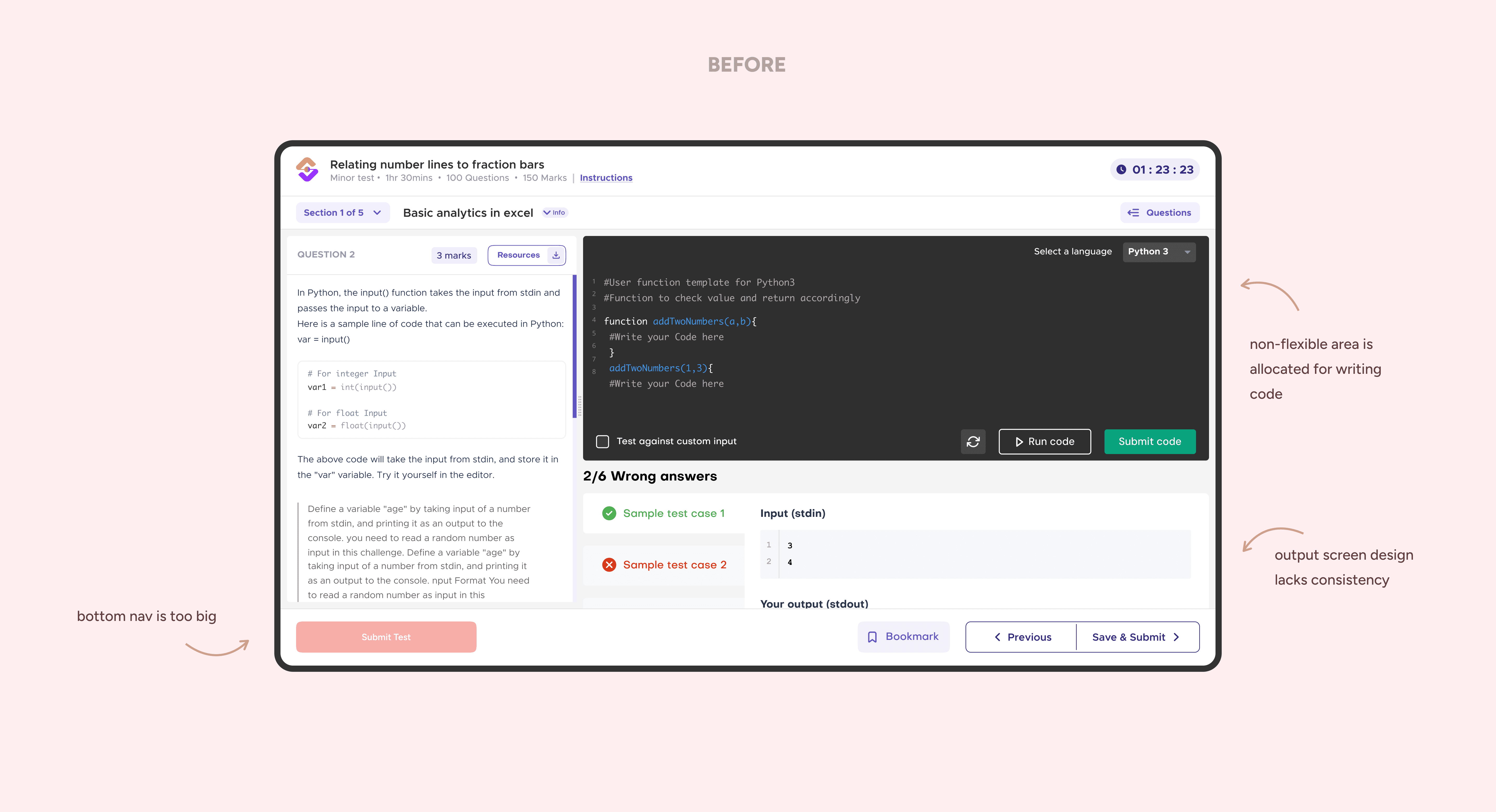
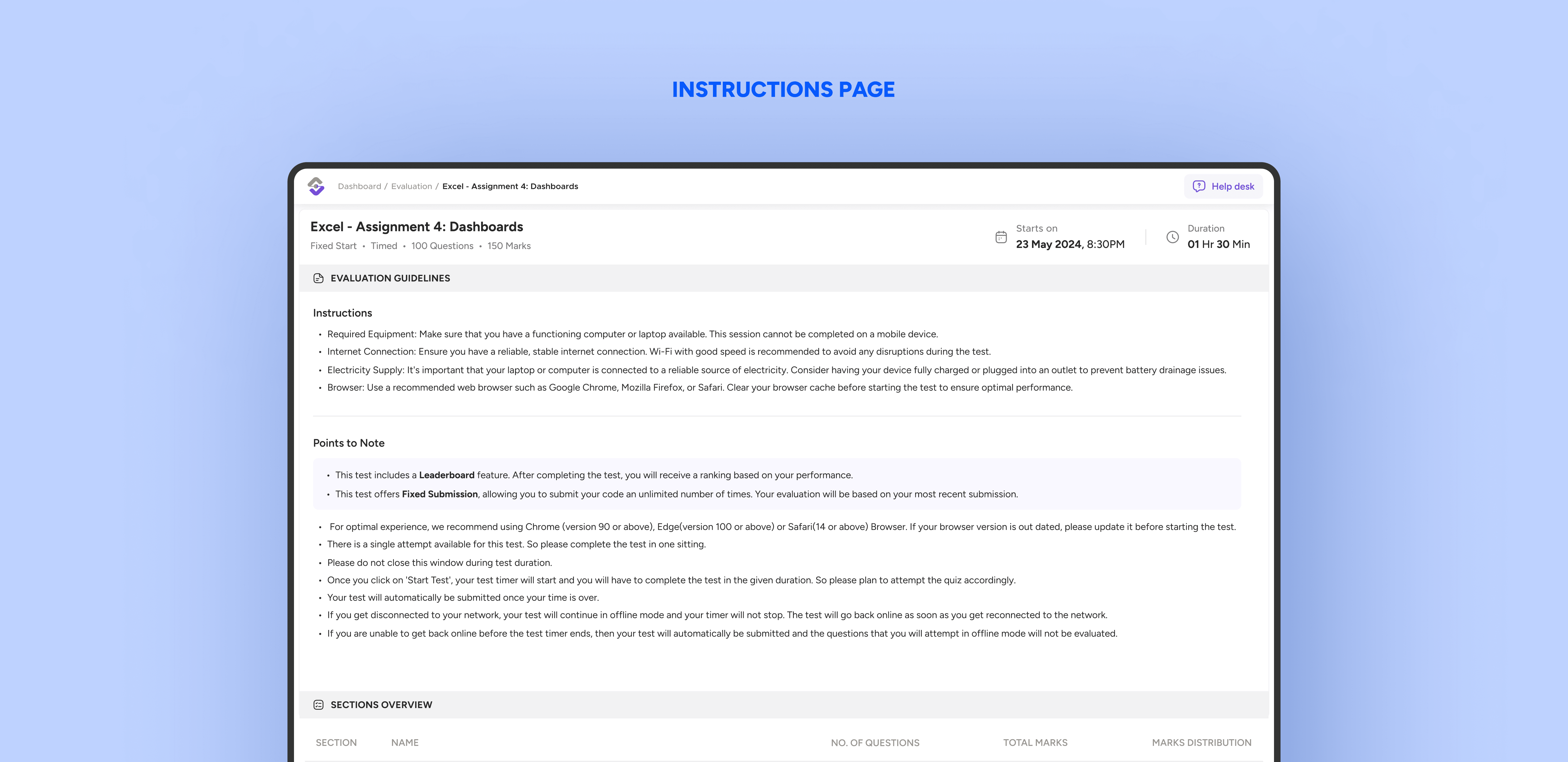
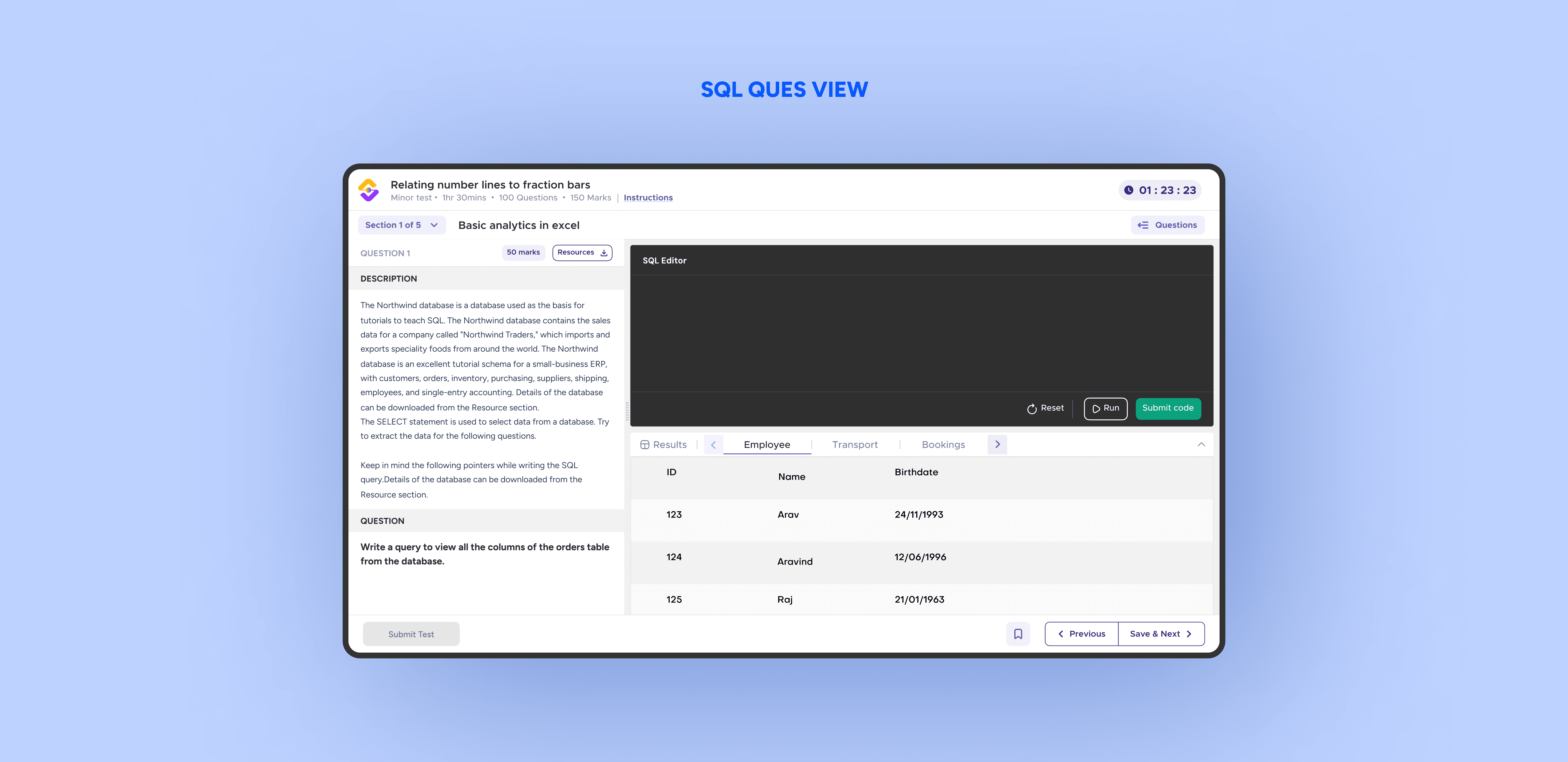
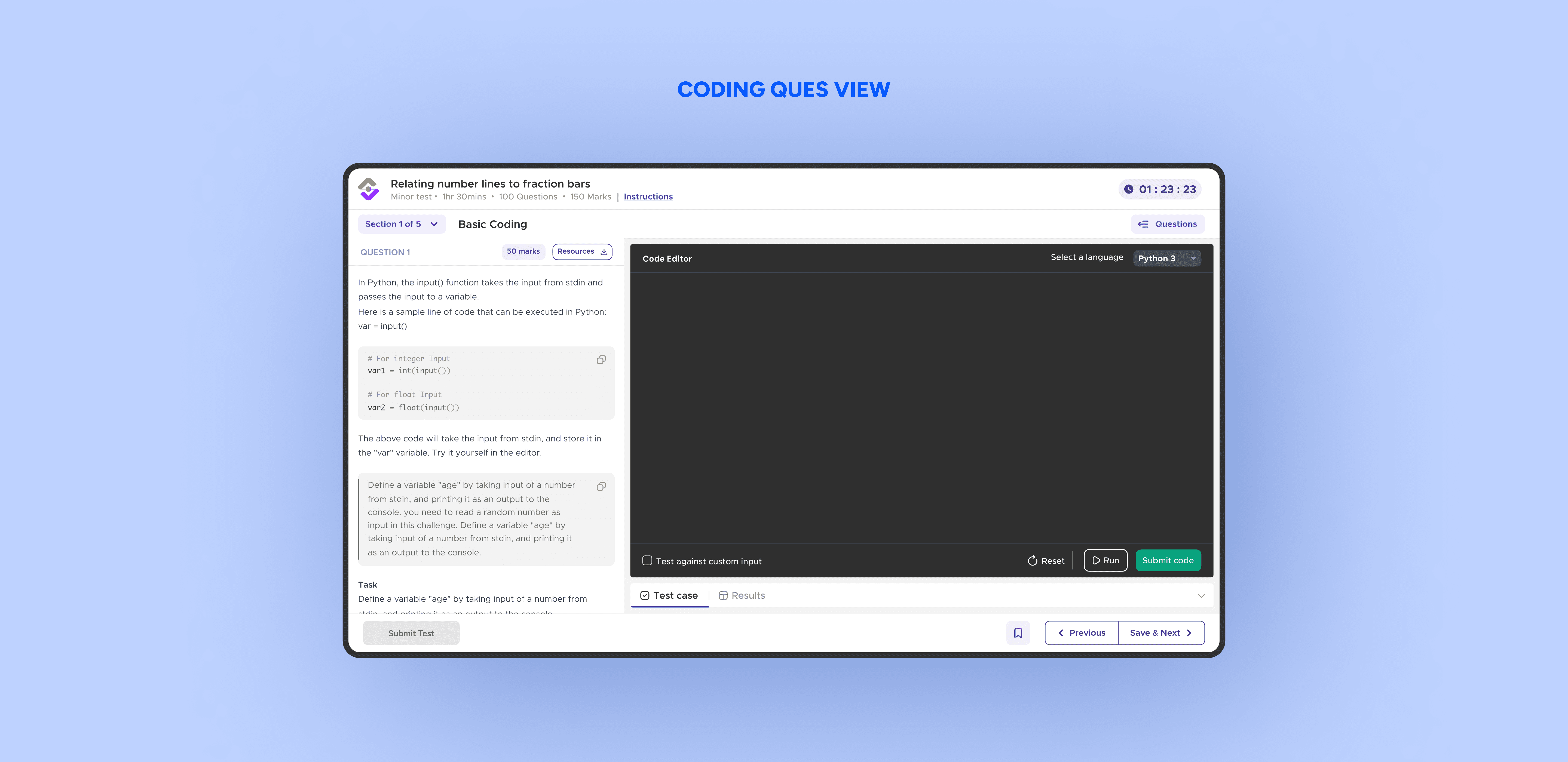
40% of users mentioned the layout felt restrictive, especially for longer coding questions
40% of users mentioned the layout felt restrictive, especially for longer coding questions
Some users complained that after submitting their code, they couldn't view some features simultaneously, which made it harder to identify and fix errors quickly
Some users complained that after submitting their code, they couldn't view some features simultaneously, which made it harder to identify and fix errors quickly